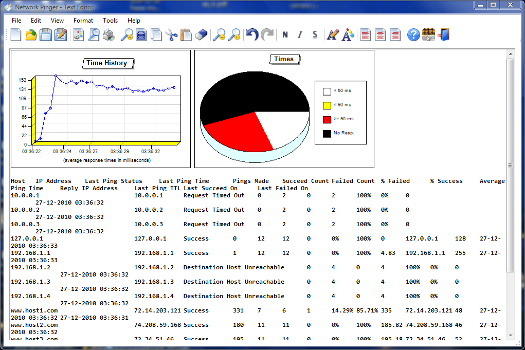
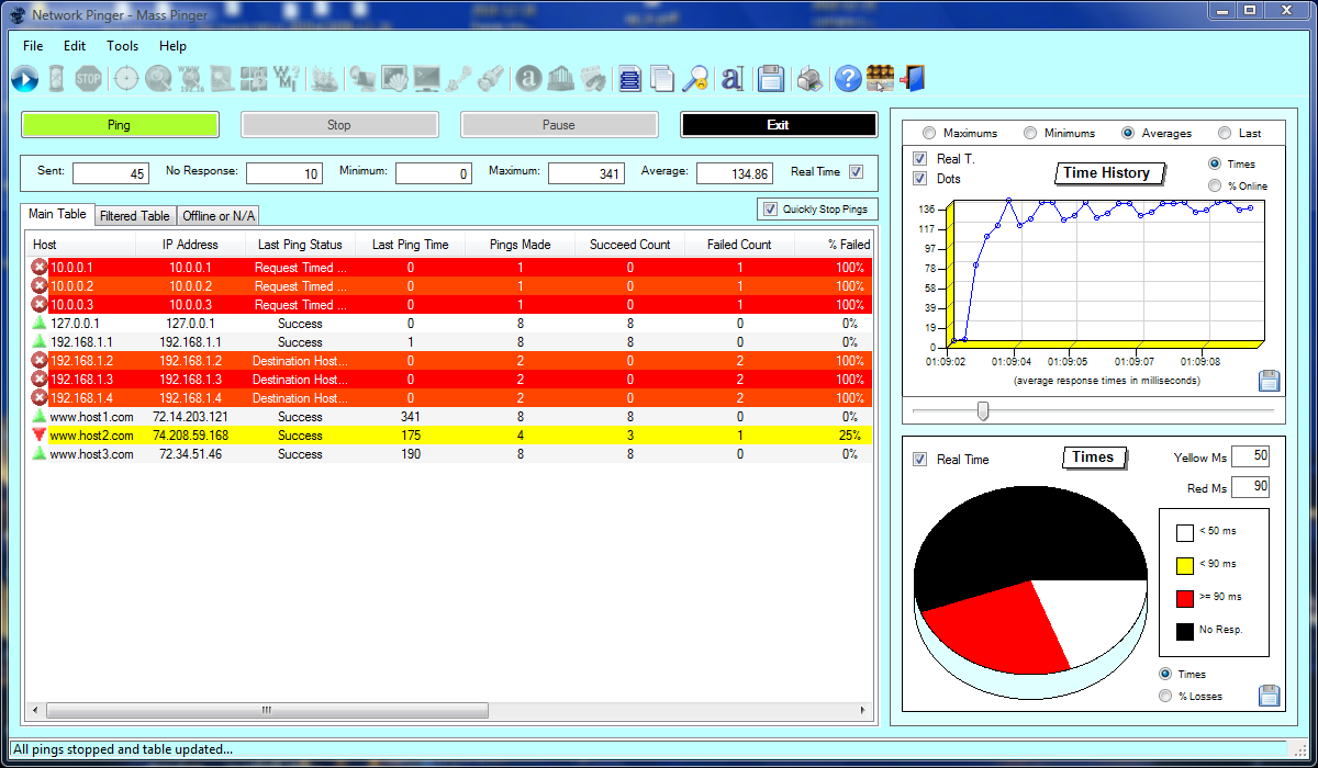
Response Times - 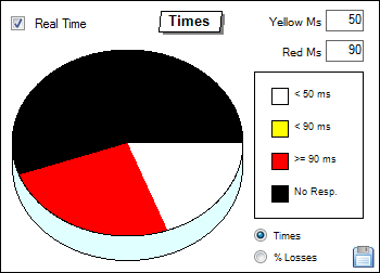 By default, the mass pings window is launched with the response times option selected in this chart. With this option selected, the chart shows us in percentages the distribution of pings through the several hosts by the levels of alerts defined by the user, and shows us a pie chart with four colours, each one for a different response time range defined for the yellow and red alerts, being the black colour always used for the pings with no responses, the white colour for those who are below the yellow alert limit defined by the user for the yellow alerts, and yellow colour for pings with response times between the yellow alert and red alert limits, and the red colour to all the pings with response times equal or superior to the value defined by the user for the red alert.
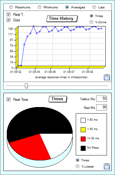
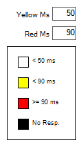 The thresholds of the yellow and red alerts are defined by the user in two boxes created for that, which are embedded on the pie chart itself, and the user only has to define those two values, the yellow alert value and the red one, and the values will automatically be written on the chart in which each colour shall have its associated value, also being the chart updated automatically whenever those values are changed. The values are defined in milliseconds, and it's impossible to define a red alert value below the yellow one, and those two levels of time measured in milliseconds are the ones that will tell the software how the colour distribution on the chart will be done.
This graphical representation of values is made according to the response times of the pings made to the group, and is useful when we want an easy and quick visualization of a mass ping response times to a group of hosts. We can this way quickly see if it has been any fall on the pings responses, so if the chart becomes all black it will be a signal that the group of hosts has lost connectivity, or if we see a big increase on the red colour it will mean that there has been a big rise on the hosts response times, which can mean that there is a traffic jam happening on a certain location or other possible problems, or even having the biggest part of the chart filled with the white colour which would be the most desirable situation, being a signal that the majority of the hosts don't even reach the level of response times that makes them entering the yellow alert level.
Hosts Online Percentage - 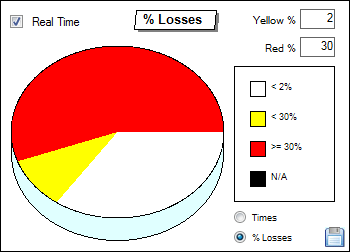 If we click on the "% Losses" on the pie chart itself, instead of having a visual representation of the response times of the hosts to be tested, we have a distribution of those hosts through the percentage quantity of failed pings happening on each one of them.
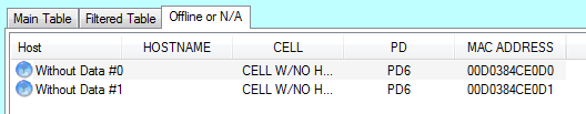
In this case, the black colour has another role. Here the black colour represents the percentage of invalid hosts read by the software, and as such, it could only appear if the group of hosts was automatically extracted from a table, where there were some invalid hosts on the column chosen for them to be taken, and that percentage of lines read with invalid hosts is the one that is made with the hosts shown on the table called "Offline or N/A", and it will be represented by the black colour. This way, if 100 lines are extracted from a HTML table on a page, and 10 of those lines would have no host whatsoever on the column where they should be, those 10 lines would appear on the table "Offline or N/A", and his chart would have 10% of its area filled by the black colour.
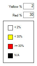 Contrary to the black colour in this chart, the other colours are defined by the user, which will choose only two levels: the percentage level in which the hosts enter the yellow alert, and the percentage level from which the hosts enter the red alert, and the software won't let the user insert a value bigger than the 100% in the red alert box for obvious reasons. This value has to do with the quantity of packet losses on the pings made to the hosts. This way, if we have defined the 2% level for pings in yellow alert and the 50% level for pings at red alert, a host which would have only 1.9% of packet loss would remain with the white colour for not reaching the 2% level, a host with a packet loss of 2% would already be on the yellow alert group for reaching the 2% level that we defined and not reaching the 50% level, as well as a host that had the 49.9% level of packet loss for not reaching the 50% we defined for the red alerts, and a host with 50% of packet loss or more, would have the red colour because of reaching the level we defined for the red alerts.
This way of visualizing data was essential in a tool and chart like this, because more important than the visualization of the response times of each host seen above, to detect traffic jams and other things, would be the necessity to see the packet loss of several hosts together on each zone, as it is usually one of the main statistics of each ping, its packet loss percentage at the end of a ping test, to find out the good quality of a connection, and this way it would be mandatory to have this kind of graphical visualization available, besides being also the default option used on the distribution of colours on the table itself.
Note: Although in this chart it is possible to change the values that define the yellow alert and red alert levels for the ping response results, it is important to notice that these values are independent from those that influence the thresholds on the tables at start-up, the thresholds in this chart are different. So, when a new mass ping tool window is launched, these threshold values will be equal to those used on the tables, the same alert levels which are defined on the main console window, but when these values are changed on the pie chart itself, they'll change only the pie chart thresholds without changing the yellow and red thresholds defined on the main console window configuration tab, and only on that configuration tab can they be changed, before launching the mass ping window.
Other functionalities on the pie chart:
There is only one other functionality on the pie chart on this mass ping window:
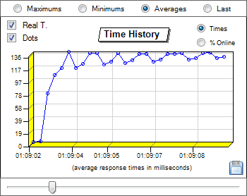
 Real Time - This check box, if checked, makes the pie chart update itself in real time while new results appear in the table. If this option is turned off, the chart won't update while the pings are running, and will only be updated when we click on pause or stop the pings, or even when we go back to put the check on the check box. It's useful in certain cases when we need maximum performances, which will make us want to deactivate the real time drawing of the chart and this way spending less CPU and accelerating the pings, although the charts don't occupy much resources on the computer due to being very optimized.
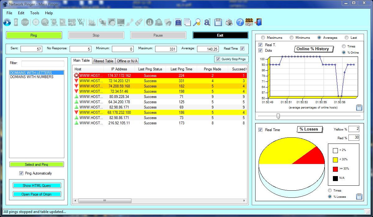
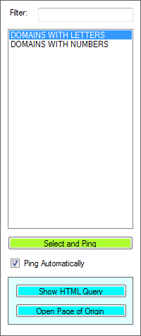 The navigation panel at left has the following controls:
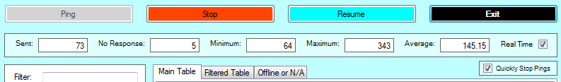
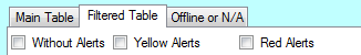 This table allows the user to choose which alerts the hosts must have to be shown here, something useful on the detection of possible problems, simply by putting a check on each filter. The existing filters are those corresponding to the three types of alerts, the "Without Alerts", the "Yellow Alerts", and the "Red Alerts". This way, we can see only those who are in the red alert position, or yellow alert, or without alert, or a combination of these, if not all of them. If they are all activated, then the table would look 100% equal to the main table, without active filters. These filters doesn't just work in real time, as well as also after the pings are stopped, because even with the pings all stopped, when we check or uncheck one of these options, they will have immediate effect on the table, and the table will be redrawn to show the hosts which have the states indicated on the active alerts defined on the filters, even if the pings are already terminated, to allow studies with filters after the tests have ended. The data in this table will be equal to the data from the main table in real time, with the sole difference of its results being filtered. A practical example of use of these filters, would be the user having selected only the red alerts, and let the pings run, and whenever some hosts would appear in this table it would be a signal that there would be some hosts in trouble, great for example for those who would want to see when some hosts on their networks stop responding.